One piece of paper was the key to the trunk colours of the subway …
On my second visit to the archives of the New York Transit Museum, on March 4, 2010, I was sifting through boxes of papers, looking forever for clues to the evolution of the subway map of New York City. The archivist, Carey Stumm, brought out a box that had recently arrived from a former desk of Leonard Ingalls. Mr Ingalls, previously a reporter for the New York Times, had joined the Transit Authority in the summer of 1964, and had overseen three transformations of the subway map, in 1967, 1972, and 1979. Sadly, almost all of his papers were discarded. This one box was pretty much all that was left. There were a number of memos and letters of background information and, suddenly, in a folder labelled “Miscellaneous”, was the most extraordinary thing. I call it the Rosetta Stone of Subway Colours.
Before I show it to you, I have to explain some of the background to the complex story of subway colours.
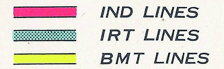
In the beginning, the New York City subway was built and run by three companies, the IRT, BMT, and IND, who each had their own maps. In 1940, they were brought under a single public body, the Board of Transportation. Rather than designing its own map, the Board bought in copies of a commercial map by Andrew Hagstrom. This represented the three networks in separate colours. That convention continued from 1943 to 1956. Even though the three railroads had now been administratively unified, they remained operationally separate, so the three-colour scheme was fine.
Collection: Peter B.Lloyd
In 1953, the Board was superseded by the more forward-thinking Transit Authority (TA), who soon commissioned George Salomon to design a new map. Salomon wanted to rationalise the entire system of signage as well as the map, but they wouldn’t let him. So, he designed only a new diagrammatic map, but he was obliged to stick to the old three-colour scheme. This worked until 1967, when the Chrystie Street Connection under Chinatown allowed interworking of the BMT and IND. After the Chrystie Street Connection opened, the red and yellow lines were no longer separate. So, the three-colour scheme was no longer tenable. What to do?
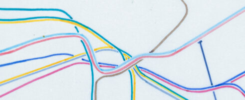
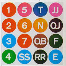
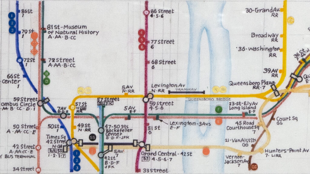
Anticipating this problem in 1964, the TA ran a Subway Map Contest over that summer. They awarded three winners but only one went forward into the design of a new map: Raleigh D’Adamo. He proposed the innovation of assigning a different colour to each end-to-end route. You can see the downtown segment of his map above (digitally re-created by Reka Komoli). At the end of each line was a route marker, and here they all are:
The following year, D’Adamo’s concept went through prototyping stages with Dr Stanley Goldstein at Hofstra University; and then Jerome Adler at the TA messed around with the designs; and finally they were given to Dante Calise at the printing firm Diamond International to sort out in 1967. Meanwhile, in 1966, the TA had engaged the services of Unimark International, led by Massimo Vignelli, to rework the subway signage. (Kind of like Salomon had wanted to do …) We have almost no documentation of what exactly was going on with the design between Goldstein’s June 1965 report and the final map that Diamond printed in November 1967. The only written material I found was a report by Barrington in May 1966 on a survey of public opinion about the new map. There is no picture of the map at this stage of its development, but the report does mention that the rectangular route markers (see above) had been replaced with circular ones (see below).
But … I recently found this scan of a Unimark slide, which shows an intermediate colour scheme, circa 1966. This is from the Noorda Design Studio, but not many people know of it. (The Vignelli Center for Design Studies has another slide that shows three of these colours (2,3,EE) but not all of them.)
Collection Bob Noorda Design
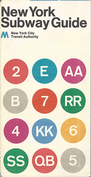
In November 1967, the new map came out, using route colours for the first time. This is the key from the pocket map. As you can see, many of the colours are different from those in the intermediate scheme.
Collection: Peter B. Lloyd
There were a lot of problems with the 1967 map, and the introduction of the new signage that was supposed to accompany it, which I will leave for another blog day. Consequently, in 1970 the TA hired Unimark, led of course by Vignelli, to re-design the map again. The Vignelli map came out in August 1972 as the famous diagram, but Vignelli was obliged to stick to the same colours (although he did rationalise them to the Pantone system). A selection of the routes markers was printed on the cover of the map:
Collection: Peter B. Lloyd
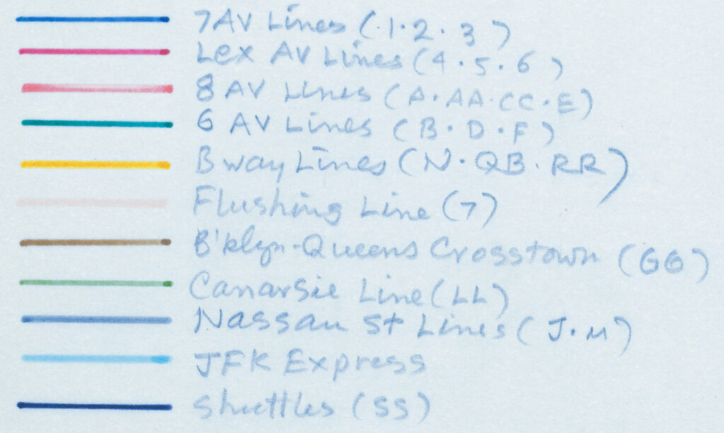
Inside, on the obverse of the map sheet, the key shows the full set of coloured route markers. (It still refers to the obsolete company names: IRT, IND, BMT!)
Collection: Peter B. Lloyd
This map lasted for seven editions to 1978. For marketing reasons, however, the MTA started a long project to replace the diagrammatic map with a geographic one. In 1978, a committee led by John Tauranac presented a map with all subway lines in one colour, namely red. This satisfied nobody, but in September 1978, an opportunity arose to overhaul the whole colour scheme. Tauranac got his wish to develop a trunk colour scheme. This bundles together all routes that share the same trunk in Manhattan. The artist and sculptor Nobu Siraisi was the given the task of figuring out how to do his. On Thursday, August 31, he presented a preliminary scheme with 11 colours:
Collection: Genji Siraisi
He worked over the Labor Day weekend to develop a series of 10-colour schemes that would be consistent with printing technology. These were presented on Tuesday, September 5. Here are two of them. There should be another two, but they are missing.
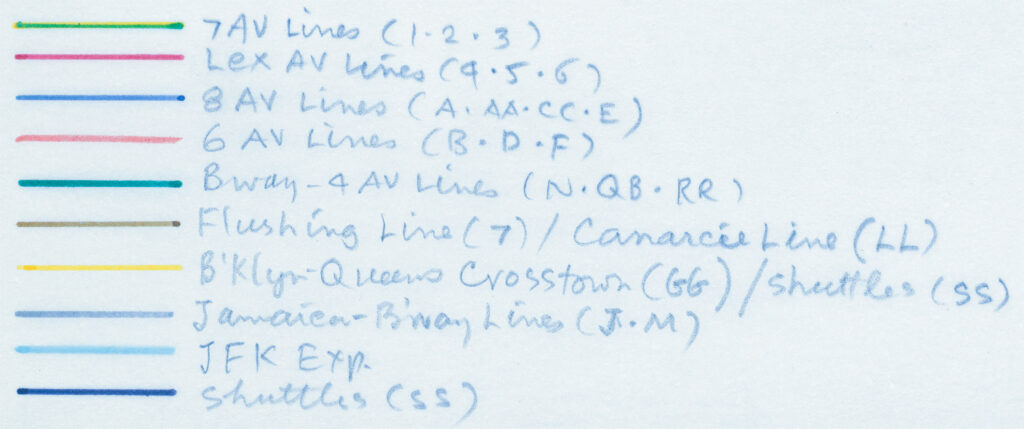
Collection: Genji Siraisi
Collection John Tauranac
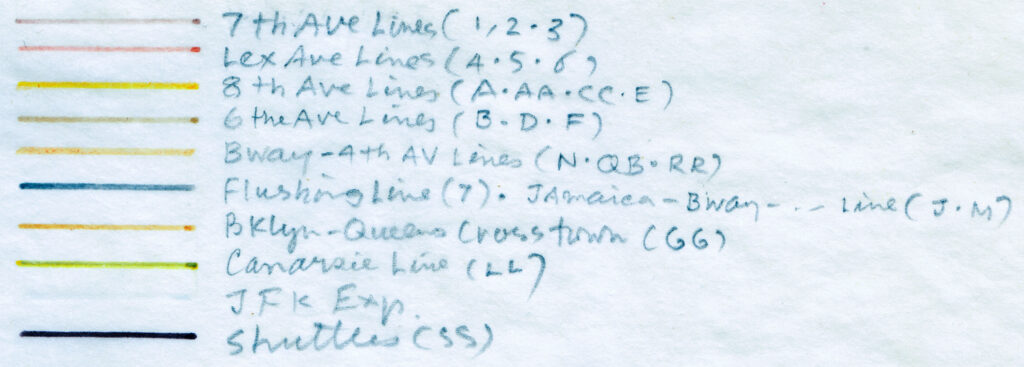
During the Fall, Sirais worked fast and hard to develop the new map. This is an undated colour key from this time. The only colour that remains fixed is the sky-blue JFK Express, which Siraisi was adamant about.
Collection: Genji Siraisi
Siraisi selected another one of his possible colour schemes and used it while developing aspects of the map such as transfer symbols (e.g. note that Lexington Avenue is red, not green):
Collection: Genji Siraisi
Siraisi was Art Director for the map project, but in the end he did not have the final say on the colours. Around February 1979, Len Ingalls was getting concerned about much it was going to cost to change the signage for the whole subway system. So he came up with the Ingalls Rule: choose colours that will minimise the number of cars and stations that have to be changed. Essentially that meant, for each trunk, select the route that had the most stations, designate that the ‘flagship’ route for that trunk, and assign the flagship colour to all the other routes that share the trunk. There were some exceptions and tweaks, but that is what was done.
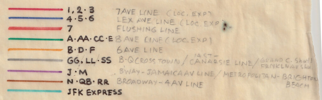
When I began my research, I interviewed John Tauranac, he told me about the Ingalls Rule, but there was no contemporary documentation to back it up. I also interviewed Mike Hertz, who claimed that he had worked out the colours by himself. And then, in 2010, I found this sheet of paper in the Transit Museum archives, which confirmed precisely what John had said. This scrap of paper so impressive, I call it the ‘Rosetta Stone of Subway Colours’!
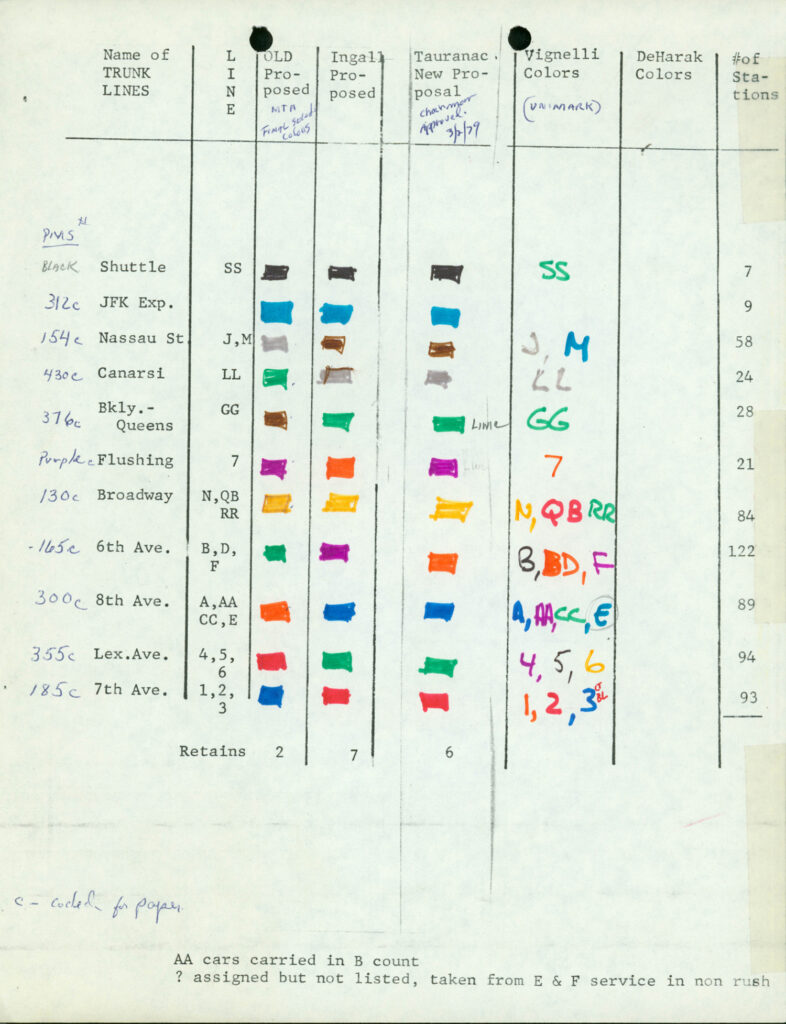
Collection: New York Transit Museum
In this table, the “Old proposed” is Siraisi’s colour scheme; “Ingall Proposed” is what Ingalls put forward; and “Tauranac Proposed” is Tauranac’s scheme, which is basically Ingalls’ scheme with some tweaks; and “Vignelli Colors (Unimark)” is obviously the colour scheme used in the Vignelli map. On Tauranac’s column is written “Chairman approved 3/2/1979”, meaning that Harold Fisher, Chairman of the MTA, had approved the scheme on March 2. These proposed trunk colours were used in the final map of June 1979, and have been in use ever since …
Collection: Peter B. Lloyd
People often ask, where do the subway colours come from? The above account provides most of the known answer to this question.
In the next blog post, I will analyse some of these colour schemes.
Thanks to the New York Transit Museum, Noorda Design Studio, Genji Siraisi, and John Tauranac for making visual materials available.
References:
Barrington & Co. a Division of Day & Zimmerman, Inc. (May 31, 1966), “A Survey of Prospective User Reactions to the New Subway Map”, prepared for the NYCTA. 58 pp. The only known copy is in Raleigh D’Adamo’s collection. But the late Hugh Dunne mentioned it in the Subway Map Debate at Cooper Union on April 1978, so I assume he had a copy, too. Probably it will surface on eBay some, which is were a lot of his vast collection has ended up.