Although the Vignelli subway diagram is the most famous map of the New York City subway system, very little is known of the design process that led to its creation. A few months ago, however, Raleigh D’Adamo came across in his basement some photocopies of sketches that he had made for Unimark in 1971. They give the first documentary insights into the map’s design process.
At the time, D’Adamo was Chief of Inspection and Review at the Metropolitan Transportation Authority (MTA), reporting directly to the MTA Chairman, Dr William Ronan. Ronan had asked Raleigh specifically to check the new subway map that was being prepared by Unimark, and request any changes that might be deemed necessary.
The contract for the new map had been signed in July 1970, on the basis of a prototype of downtown New York. This was a ‘comp’ or composition created by Joan Charysyn under the design direction of Massimo Vignelli.
Over the following year, this prototype was expanded into a complete map of the system. According to Charysyn, by the summer of 1971, the map was essentially complete. And, by August 1971, Leonard Ingalls of the Transit Authority (TA) was ready to sign the contract to print the map. It was around this time that Chairman Ronan asked for further scrutiny of the map. Over the following months D’Adamo met several times with Norbert Oehler, a senior designer at Unimark, to discuss corrections and improvements to the map’s design. Those changes were then carried out by Joan Charysyn. Vignelli himself had quit Unimark at the end of April 1971 and set up his own design firm, Vignelli Associates, based in Riverdale in the Bronx. He was therefore no longer present on a daily basis at the Unimark office at 410 East 62nd Street, Manhattan. Although he stayed in contact with the Unimark office regarding some ongoing projects, we must assume that D’Adamo’s suggestions were handled by Oehler and Charysyn with little or no direct involvement from Vignelli.
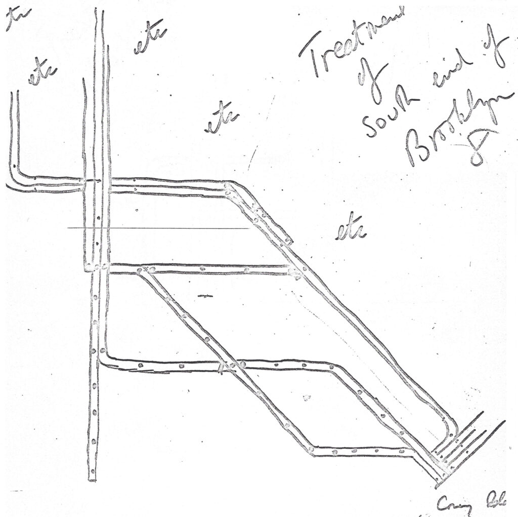
Some time in late 1971, Joan Charysyn and Virginia Macintosh created a small number of Station Signage Studies. These included a slightly blurry photocopy of a black-and-white version of the map. This differed very little from the final map that was issued in August 1972. (Except of course, that it was black-and-white while the final map was in full color.)
Apart from the 1970 prototype, and this 1971 black-and-white map, there was until recently no other documentary evidence of the design process. After D’Adamo found his old sketches in his basement, he very generously sent me scans of them, and I was able to make a careful analysis of them. These provide, for the first time, some pointers to the intermediate design stages, and the Unimark team’s thinking.
I have uploaded a detailed analysis of the sketches here: www.peterblloyd.com/transit.
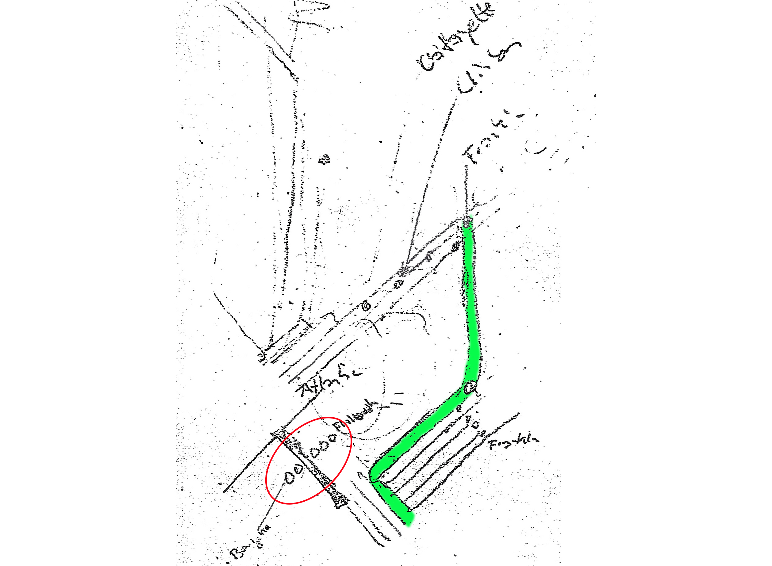
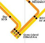
As an example, one of the sketches concerns Coney Island, where D’Adamo proposes a simplification of the geometry of lines entering this terminal.
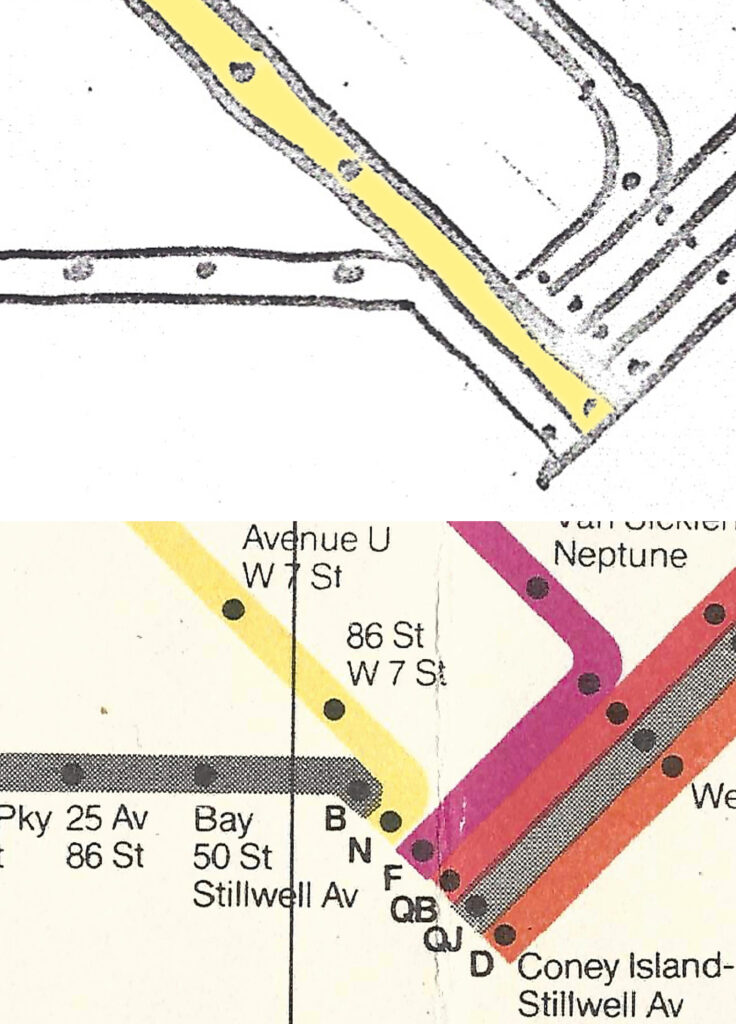
This suggestion was rejected by the Unimark team. According to Vignelli’s visual grammar, if subway routes run together, even if only for one station, then their depiction on the map had to be aligned. Hence the B train and N train had to be twisted around to join the other routes entering Coney Island station. It is interesting that, in the 2008 resurrection of the map, Vignelli gives all the routes that pass into Coney Island station an extended run, thereby avoiding the inelegant twists of B and N seen above.
Roughly half of D’Adamo’s suggestions in this cache of sketches were accepted and became a permanent part of the Vignelli map. The others, although rejected, reveal insights into the visual grammar of the map.