The man who shaped the subway map for a generation …
The shape of the route lines on the New York City subway map are so familiar to us that we barely glance at them even when we sit opposite the map on a subway car. Like everything else in the human-made environment, they have a story to tell about who designed them and why. This story begins with Nobuyuki Siraisi, a Japanese-American fine-art sculptor, painter, and graphic designer. Before the subway map, Siraisi worked with leading artist Isamu Noguchi and created a number of punchy works of art in the 1960s. Here is one of them — ‘Homeward with Treasure’ (1963):
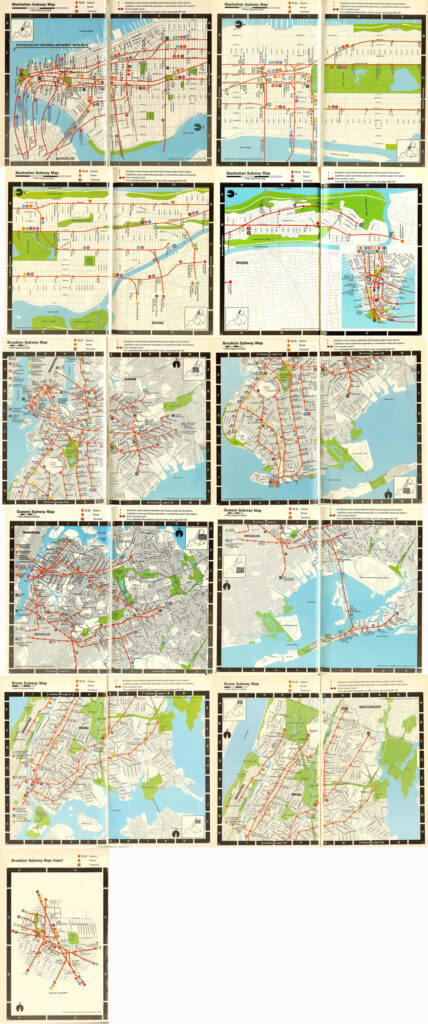
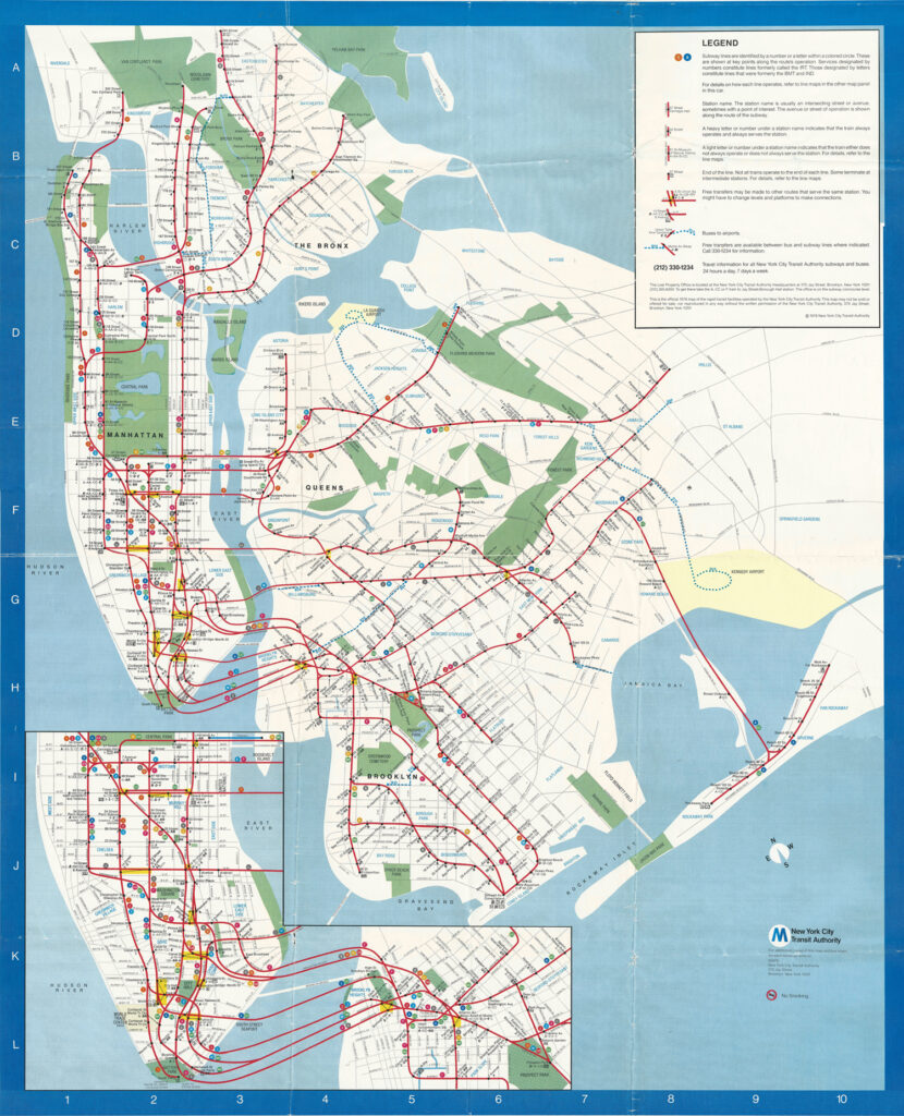
In August 1972, the MTA launched Massimo Vignelli’s subway map. Two and a half years later, they began the process of replacing it. Under the chairmanship of MTA appointee Fred Wilkinson, the TA’s Subway Map Committee struggled for a year and a half, from July 1975, to establish a workable design for a post-Vignelli map. In the summer of 1976, however, John Tauranac emerged from writing and editing the vast and highly successful MTA guide-book, Seeing New York, and advised the Committee to begin its design work afresh, starting from the geographic subway map he had put in the guidebook. This was the first ever official MTA subway map done geographically. It looked like this:
As a candidate replacement for the Vignelli subway map, this had two basic problems:
- First, all the subway lines are all red. This makes it hard to tell which line is which, especially in congested areas such as DeKalb Avenue.
- Second, it is huge: in Seeing NY, it spanned twenty-one pages. This cannot realistically be printed on a map sheet.
As we shall see, Nobu Siraisi played a crucial role in solving both of these problems.
The MTA had retained Michael Hertz Associates to carry out the graphic design on behalf of the Subway Map Committee, which directed all aspects of the design. Hertz hired Nobu Siraisi in February 1977, and he set to work deforming the land masses of New York City to fit onto a roughly square frame, with space to show the subway routes clearly. At about the same time, the committee moved sideways from the TA to come under the control of MTA Marketing with John Tauranac as chairman.
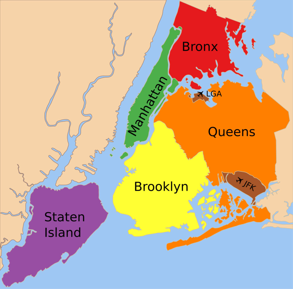
Nobu essentially squared the circle: he deformed the land masses while keeping the appearance of topographic realism. He broadened Manhattan to give enough space for the many subway lines that run uptown-downtown along the island, and squashed and twisted Brooklyn upwards, allowing it to sit within a square map sheet. (This followed Vignelli’s square format. The final map in 1979 re-used Nobu’s coastline except that the Rockaway Peninsula was moved 1.5 miles west, to save a lot of empty paper, thereby forgoing Vignelli’s symmetrical square format.) This is what New YorkCity actually looks like:
Below is the deformed coastline that Siraisi had prepared by the end of 1977. (Other details of the map were drawn by colleagues under Siraisi’s direction.) As in the map that had appeared in the guidebook Seeing NY, all the subway routes were red. Only a few hundred copies of this map were printed, but it stands as a milestone on the journey from 1972 to 1979.
This map represented a significant step forward, and it was displayed to the public in the Cityana Gallery in February 1978, as well as the AIGA exhibition MASSCOMM / MASSTRANS (organised by Aaron Marcus and Peter Laundy). At the AIGA show, this protoype map triggered Modernist members of the New York design community into apoplexy. That, in turn, led to the famous Subway Map Debate at Cooper Union, where Vignelli and Tauranac went at it. The debate provided an opportunity to understand the two conflicting world-views, but really it had no effect on the course of events. (The most prestigious design community in the world tussles with the biggest transit operator in the world. Take a guess who’s going to win.) The feedback from Cityana did, however, confirm what Tauranac already knew: the red line map was “dead in the water”. So was the red and blue variant that was shown at Cooper Union. What he had wanted all along was a trunk-colored scheme. Each trunk in Manhattan would be assigned a colour, and all the branches uptown and downtown from a given trunk would share that trunk’s colour. To make this happen, however, he would have to change all the colours of train and station signage to match the map. Yet the MTA, and indeed New York City, was still in dire financial straits. What to do?
During 1978, the committee made refinements to the map, but the central problem remained. By the Fall, however, the Federal Government had provided substantial financial aid to New York City, and the MTA got its share. The result was a feeding frenzy as cash-starved departments and stakeholders fought for a share of the funds. At this point, Tauranac’s vision of a trunk-coloured subway map received help from a surprising quarter. Mrs Phyllis Cerf Wagner—former Hollywood starlet, former wife of publisher Bennett Cerf, wife of former mayor Robert F. Wagner, Jr., now a highly networked socialite—was appointed chair of the MTA Aesthetics Committee and took an interest in Tauranac’s map.
“How’s the new subway map going?”, asked Mrs Wagner. “Dead in the water,” answered Tauranac. He explained that the only way forward was to introduce trunk colours. She asked to see a mock-up. Over the Labour Day weekend, Siraisi created a set of mock-ups. This was quickly approved (‘quickly’ meaning in one working day), whereupon creation of the geographic map proceeded at breathtaking velocity, and was issued in June 1979. With various modifications, it’s been the official map ever since.
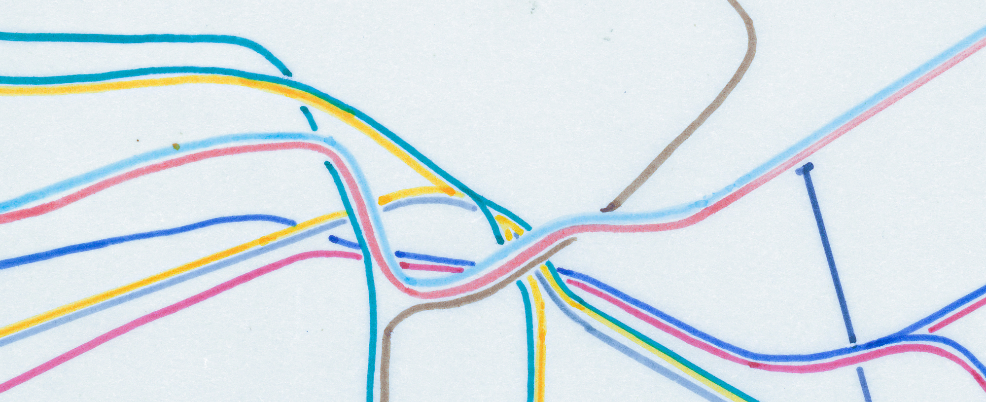
Over the three days September 2 to 4, Siraisi created four different variants of workable trunk colouring schemes; and four copies of each such variant. By the end of the week, at a meeting on Friday, September 8, the four ringleaders signed this revolutionary document: John Tauranac, Hugh A. Dunne, Nobuyuki Siraisi, and Phyllis Cerf Wagner. Each signatory received a set of the variant sketches. Here’s one of them:
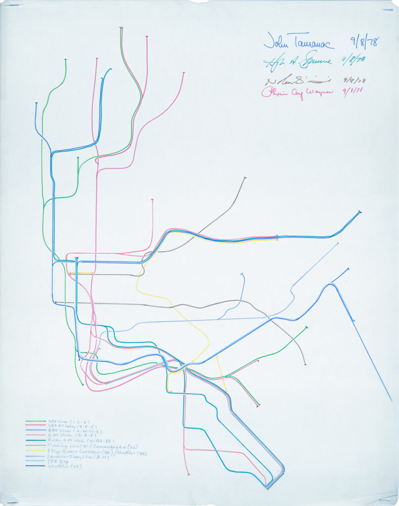
And here’s a detail showing the graceful branches in uptown Manhattan and into the Bronx, retaining their respective trunk colours:
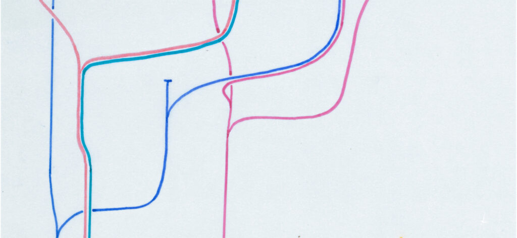
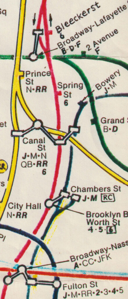
This was technically challenging. With a palette of only ten colours, Siraisi had to ensure that two trunks of the same colour ever had their branches run alongside each other. Some of the complexity he had to deal with can be seen at DeKalb Avenue:

The sixteen sketches had identical geometry, differing only in colouration, and were drawn freehand in ink, with no bodges or corrections—a measure of Siraisi’s technical skill. Once the trunk-coloured scheme had been settled, Siraisi had to work hard and fast to develop the rest of the map, including the transfer symbolism and the rush-hour services (shown by diamond route markers on the map). Below, we see his sketch for midtown Manhattan. Note the intermediate colour scheme, which was used in drafts from September 1978 to March 1979, after which Tauranac’s new scheme came into effect. (For example, here Lexington Avenue is red; Tauranac made it green for reasons that I shall save for another blog post.)
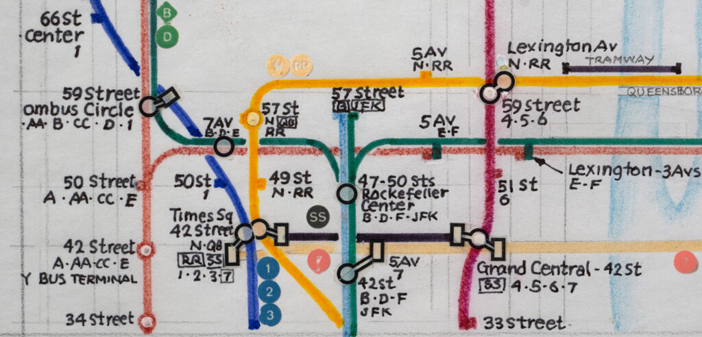
The complex transfer stations of lower Manhattan required particular ingenuity, far removed from the minimalism of Vignelli’s “no dot, no stop” rule. Note the oddity of Bleecker Street, where the southbound track of the Lexington Avenue trunk (red) has a transfer to the Sixth Avenue trunk (green) but the northbound track does not. (An infamous omission from Vignelli’s map.)
The final result was a thing of awesome beauty and technical virtuosity. More complex than any previous map of the New York City subway, more stuffed with information to help the perplexed rider, the map created by Siraisi in conjunction with the work of the MTA committee under the leadership of John Tauranac, still stands as a landmark of cartographic brilliance. A lot of sound and fury has been spent fighting over which map was best, 1972 or 1979. I believe it is more constructive to deep-dive into the designs of both maps and develop an appreciation of their ideas, their strengths, and their weaknesses.
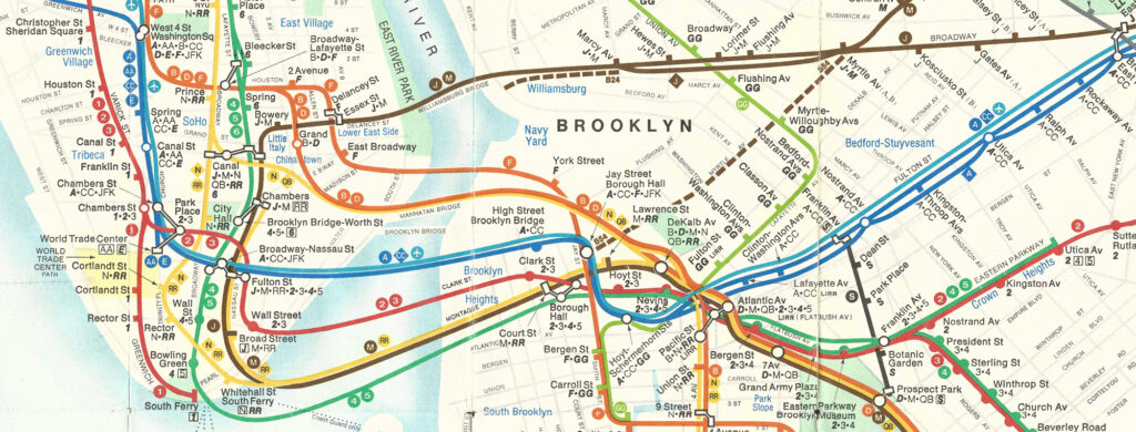
Below is a segment from the 1979 map, showing refinements of the curves of 1978, quite apart form the army of symbols:
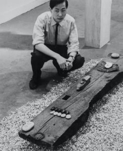
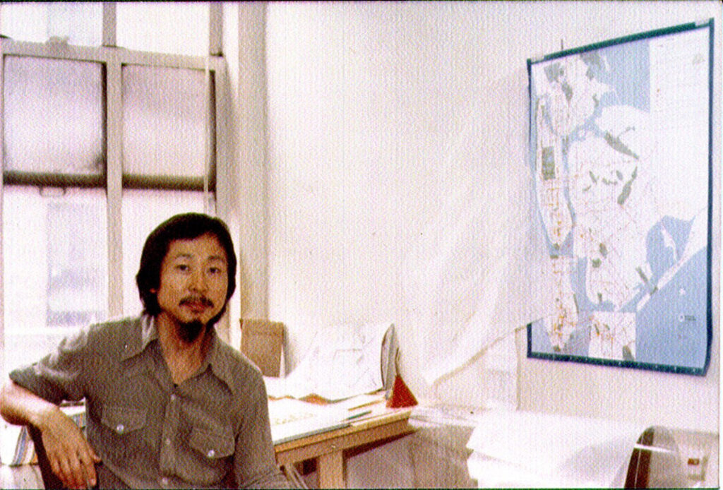
Nobu Siraisi was a humble and dedicated artist and designer, whose contribution to wayfinding on the subway—and indeed to New York’s image of itself—has been neglected for many years. Below, we see Nobu in the office of Michael Hertz Associates, with the 1978 Cityana map on the wall, and a desk strewn with tracing paper and huge sheets of acetate:
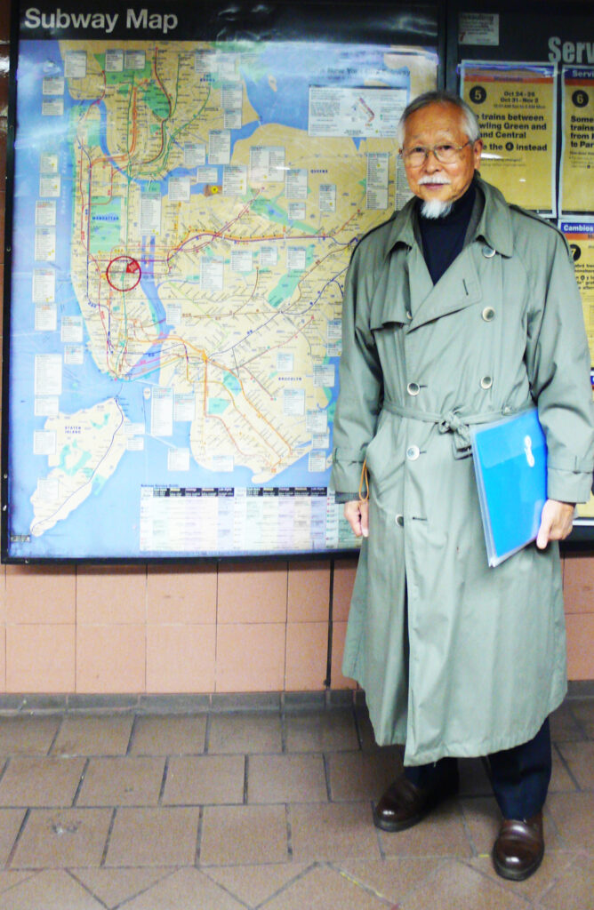
In 2009, I had the pleasure of interviewing Nobu with Mark Ovenden, gleaning invaluable insights into his design of the map. Here is Nobu after the interview, standing in front of a remote descendant of the map he drew, at Bryant Park Station.
Tragically, Nobu passed away in 2016. I am indebted to his son, Genji Siraisi, for making available to me high-resolution scans of Nobu’s original sketches. I had the pleasure of meeting GRAMMY-nominated musician Genji in person on my recent trip to New York. Below is Genji at Hasaki, Nobu’s favourite restaurant:
The information provided by Nobu, and the scans provided by Genji, are being incorporated into my forthcoming book, Geography Bites Back: Volume 6 of A History of the New York City Subway Map.
CREDITS:
- “Homeward with Treasure”, sculpture by Nobu Siraisi, photographer unknown, collection: Genji Siraisi.
- Subway map in Seeing New York, designed by John Tauranac, executed by Michael Hertz Associates, copyright 1976 MTA, collection: Peter B. Lloyd..
- New York City outline, Khan Muhammad Nafee Mostafa Sadh, 2014.
- Prototype subway map, designed by Nobu Siraisi, copyright 1976 MTA, collection: Peter B. Lloyd.
- Sketch of trunk colour scheme, by Nobu Siraisi, copyright 1978 MTA, collection: Genji Siraisi.
- Detail of 5.
- Detail of 5.
- Fragmentary sketch by Nobu Siraisi, copyright 1978 MTA, collection: Genji Siraisi.
- Fragmentary sketch by Nobu Siraisi, copyright 1978 MTA, collection: Genji Siraisi.
- Segment from final map, copyright 1979 MTA
- Nobu Siraisi, photographer unknown, 1979, collection: Michael Hertz.
- Nobu Siraisi, photograph by Peter B. Lloyd, 2009,
- Genji Siraisi, photograph by Reka Komoli, 2022.
Genji
4 Feb 2022Thank you, Peter, for bringing this story to light and to life. The whole family is very grateful to you for the recognition you are giving to my father’s work on this map which is amazingly essentially still in tact 43 years later. They did finally connect the uptown and downtown 6 with the F at Bway Lafayette/Bleecker, which is very helpful, but one of my favorite train announcements before that change and to the mostly automated announcements was, “Next stop, Broadway Lafayette, transfer to the DOWNTOWN 6 ONLY….Reason….unknown!”
admin
4 Feb 2022No, thank you, Genji, for conserving and making available your father’s map sketches, and his art works. As well as that super book that you and Maro published with Nobu in 2012. Coincidentally, that was the same year the MTA unveiled the new transfer connection at Broadway – Lafayette, celebrating it with the art installation by Leo Villareal entitled “Hive (Bleecker Street)”, which is still there to remind us of the days of “Reason .. unknown”!
Tube Map Central
6 Feb 2022What book? My list needs updating, is there something else to add?
http://www.tubemapcentral.com/writing/thirdparty.html
admin
7 Feb 2022Hello Max,
Thanks for listing my first book, “Vignelli: Transit Maps” (RIT Press, 2012). I am now approaching the end of the (unexpectedly long) process of preparing the next book, “Geography Bites Back: Volume 6 of a History of the New York City Subway Map”. Hence the launch of this blog and associated social media to support it. The text of this book is written, and I have now finalised and laid out 150 pages with InDesign. The aim is to complete the laid-out draft by August, complete with visuals and permissions for visuals, and then hand it over to my proof-readers and fact-checkers for publication at the end of the year. This book covers the work of the Subway Map Committee in replacing Vignelli’s diagrammatic map with a geographic one, 1972-1979.
Peter
Tube Map Central
9 Feb 2022Thanks Peter, I look forward to it, but I meant the book you refer to in your note by Genji, Maro and Nobu, I can’t find any reference to it anywhere, although Google seems to hide more stuff than it finds these days. Nothing on Amazon either
admin
9 Feb 2022Max,
Ah, sorry! That book is:
“Selected Works of Nobu Siraisi”
Published & distributed by Blurb
with foreword and interview by Genji & Maro Siraisi, 2012, 3 pp text, 37 pp full colour artworks.
Standard Landscape, 10×8 in, 25×20 cm, no ISBN
https://www.blurb.com/b/3637712-selected-works-of-nobu-siraisi
Peter
Theresa
4 Feb 2022Thank you all for sharing, I read the whole article and find it immensely interesting, impressive and important, even on the other side of the world, ‘cos we all know the beauty of subway maps, right? All the very best from Vienna!
admin
4 Feb 2022Thank you, Theresa! Of course, the Wiener Linien has both an elegant diagrammatic map of the U-Bahn + S-Bahn, as well as a geographic city map that embeds the transport network. Do you have a preference in using the diagrammatic map or geographic map in your city?
Eddie
9 Feb 2022Bravo – Brilliant research and analysis of one of the most debated mapping controversies that persists to this day, 42 years after its introduction. Your persistence in tracking down the concept sketches of Nobu Siraisi for the now iconic New York City subway map are, for a mapmaker like me, like finding Roebling’s concept sketches for the Brooklyn Bridge.
admin
9 Feb 2022Hi Eddie,
Ah, the bridge aficionado’s treasure trove!
Well, all I did was to track down Genji, and he did the rest! And yes, they are as exciting for a map historian as for a map designer. (I’ve never designed a map in my life, and don’t intend to. I’ll leave that to those with a talent for it!) By the way, the book will contain all the sketches, not just the sample in the blog.
Stay tuned for the coming blog post on colours – from Raleigh’s 1964 sketch (courtesy of Reka Komoli‘s digital reconstruction), through Unimark’s 1966 colours courtesy of ‘Bob Noorda Design Studio‘, Dante Calise’s colours in the published 1967 map, then some of Nobu Siraisi’s colour permutations, courtesy of Genji Siraisi, and ending with what I call the ‘Rosetta Stone of Subway Colours’, a remarkable sheet of paper that arrived at the Transit Museum in a small bundle of papers found in Len Ingalls’ desk, which he thankfully forgot to dispose of before his retirement!
Peter